- Your cart is empty
- Continue Shopping
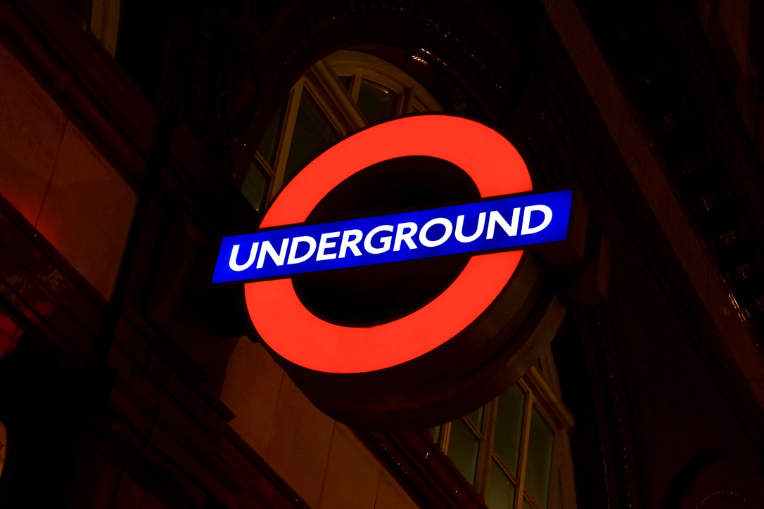
The London Underground roundel is arguably the most recognizable transit symbol in the world—a simple red circle crossed by a blue bar that has guided millions of passengers through the Tube for over a century. But there’s far more to this beloved emblem than meets the eye. Here’s a look at the history, design, and cultural impact of this quintessentially British icon.
1. It Predates the Modern Logo by Decades
The roundel’s origins trace back to 1908, when the Underground Electric Railways Company of London first placed a solid red disc behind station names to make them more visible against the cluttered advertising posters of the era. The blue bar came shortly after, creating the basic form we recognize today.
2. Frank Pick Made It Iconic
Frank Pick, the visionary commercial manager (and later managing director) of the Underground, commissioned calligrapher Edward Johnston in 1916 to refine the design. Johnston’s contribution included the distinctive Johnston typeface—a clean, humanist sans-serif that remains in use today and influenced countless fonts that followed, including Gill Sans.
3. The Proportions Are Precisely Mathematical
The classic roundel follows strict geometric principles. The ring’s inner diameter relates to its outer diameter by specific ratios, and the bar’s height and positioning are carefully calculated. This mathematical precision ensures the symbol remains balanced and readable at any size, from tiny pocket maps to massive station facades.
4. It’s Called a “Roundel” for Good Reason
The term comes from heraldry, where a roundel is a circular charge on a coat of arms. The Underground adopted this formal name to distinguish its symbol from generic circles or targets, lending it an air of British tradition and authority.
5. Different Colours Mean Different Services
While the classic red and blue represents the Underground itself, Transport for London uses variations for other services: green for the tram network, orange for Overground, cyan for the Docklands Light Railway, and magenta for the Elizabeth Line. Each maintains the same fundamental design while signaling a distinct service.
6. It’s Survived Remarkably Unchanged
Unlike many corporate logos that undergo radical redesigns every decade, the roundel has maintained its essential character for over a hundred years. Minor refinements have occurred—slight adjustments to proportions, updates to the typeface—but the fundamental design remains faithful to Johnston’s vision.
7. Artists Have Reinvented It Countless Times
The roundel’s simple geometry makes it perfect for artistic interpretation. For the 150th anniversary of the Underground in 2013, one hundred artists created unique versions. From Yayoi Kusama’s polka-dotted interpretation to Larry Achiampong’s powerful commentary, the roundel continues to inspire creative reimagining.
8. It’s Protected as Intellectual Property
Transport for London actively guards the roundel as a registered trademark. This protection ensures the symbol maintains its integrity and association with London’s transit system, though it’s also led to a thriving market in officially licensed merchandise and vintage-style memorabilia.
9. Station Roundels Are Individual Works of Art
Each station’s roundel sign is positioned and sized according to its specific architectural context. Many historic stations feature original enamel roundels that are now considered heritage items, carefully preserved as part of London’s design legacy.
10. It’s Become Shorthand for London Itself
Perhaps the roundel’s greatest achievement is transcending its functional origins. Today, it represents not just the Underground but London as a whole—appearing on everything from tourist souvenirs to fashion items. For Anglophiles worldwide, the roundel evokes the romance of the capital, the rattle of Tube trains, and the particular thrill of emerging from an Underground station into a London street.
Bring the Roundel Home
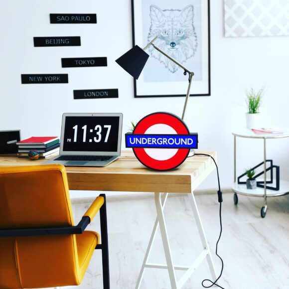
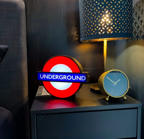
There’s something magical about the Underground roundel—it captures the spirit of London in a single, elegant symbol. If you’ve ever wanted to bring a piece of that London atmosphere into your own space, we’re delighted to announce that our Tube Station Lightboxes are back in stock.
These beautifully crafted illuminated signs feature authentic roundel designs with classic station names, creating an instant focal point in any room. Whether you choose Piccadilly Circus for its theatrical associations, Baker Street for its Sherlock Holmes connections, or Abbey Road for its musical legacy, these lightboxes offer a daily reminder of your favourite city.
Perfect for home offices, living rooms, or anywhere that could use a touch of London charm, our Tube lights make thoughtful gifts for the Anglophile in your life—or a well-deserved treat for yourself.
Mind the Gap: London Transport Themed LED Lightbox – Large Version
$69.99Current price is: $69.99. Original price was: $79.99.
A beautiful LED Lightbox dedicated to the London Underground, featuring interchangeable signs. LIMITED STOCK!
Availability: 8 in stock
Add to cart
Buy Now
Mind the Gap: Mini London Transport Themed LED Lightbox – Small Version
$34.99Current price is: $34.99. Original price was: $39.99.
A beautiful LED Lightbox dedicated to the London Underground, featuring interchangeable signs.
Availability: 5 in stock
Add to cart
Buy Now